

We put the golden ratio in the witness box and made our own work take the stand.
No spirals. No mysticism. Just a tape measure and a campaign that had some explaining to do.



You have seen this spiral everywhere: winding across the Parthenon, gracing the Mona Lisa, curling inside a nautilus shell, shining in the Apple logo, and spinning through every LinkedIn carousel that claims to unlock the secrets of good design. The golden ratio, or phi (1.618), is the designer’s favorite bit of magic. It is whispered to be nature’s secret code, the mathematics behind beauty itself.
We set out to discover whether the golden ratio truly shaped our work, or if we, too, had been spinning ourselves a comforting myth, just like everyone else.
So we chose a campaign we’re proud of, the “Dive In and Deck Out” rebrand for the International Pool, Spa, Patio & Deck Expo. We dug up the real print files and measured them, not by eye but with precision. Each ad was mapped to its true trim size, every major grid line tested against phi.
We sorted the whole set into three piles: where phi truly belonged, where something landed near it by accident, and where overlaying a spiral would be pure fantasy.
The results surprised us, and that alone makes the story worth telling.
The ad everyone bet was golden.
Here’s our hero: a full-page ad with a diver and a bold red ribbon slashing across, the words “Dive in” in sweeping cursive. If you had to pick one piece from the campaign that looks like it was built on the golden ratio, this would be it. It just looks the part.
But it is not.
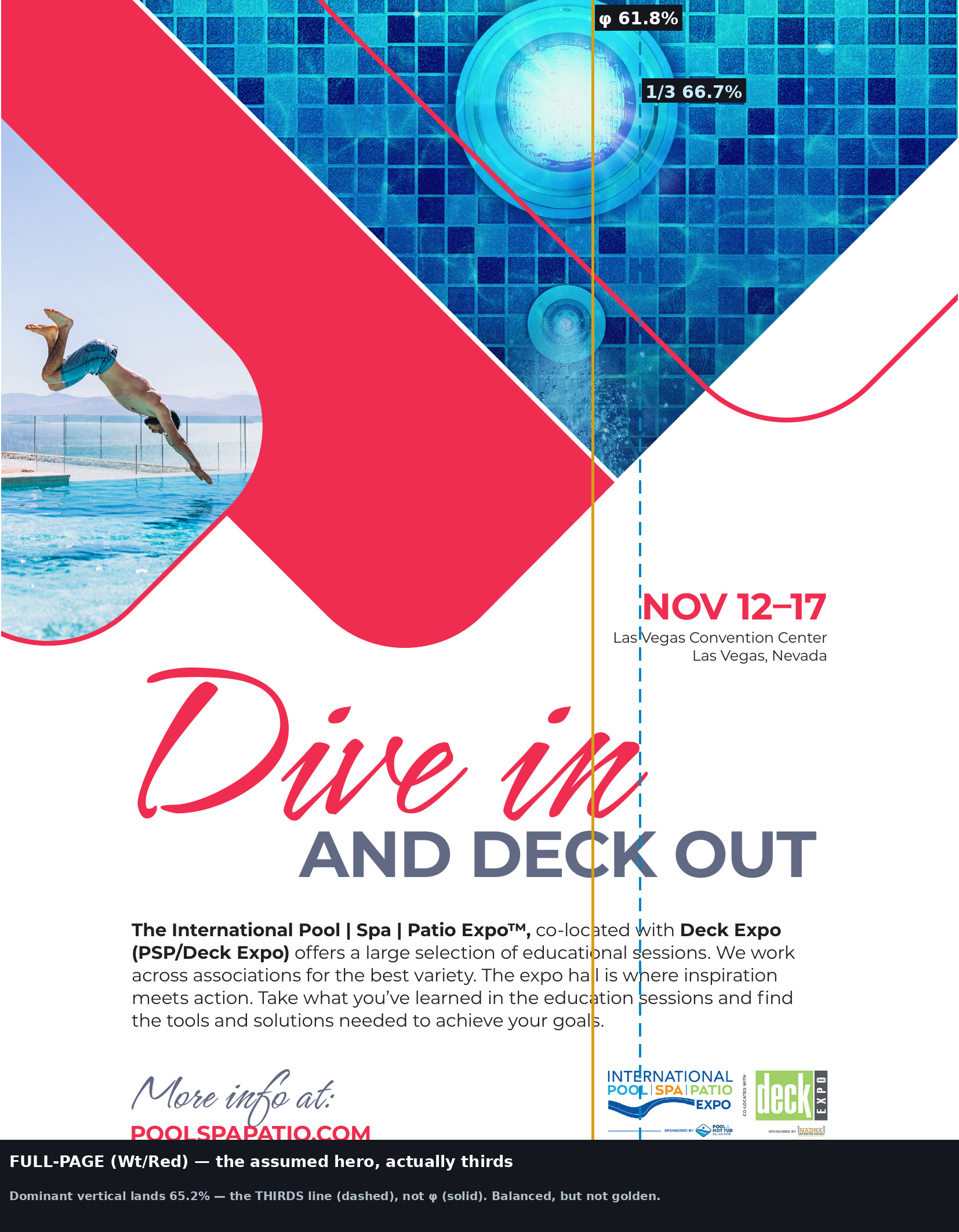
The solid gold line is the one phi would be on. The dashed blue line represents thirds. The “NOV 12–17” block and the copy column align themselves with the thirds line, and the gold line passes through the space just to the left of it.
The main vertical division occurs at 65.2% of the page width, the golden point is at 61.8%, and the thirds mark is 66.7%, that is, it’s based on thirds. As for the horizontal arrangement, it’s centered and two-thirds. It’s a beautiful, balanced, deliberate composition based on a rule-of-thirds grid, not on phi.
The entire point of the exercise was that the piece that appears most golden is, in fact, not golden. Had we simply stated that “phi occurs everywhere in this work”, we would have been mistaken about our own flagship.
Where it actually earned its place.
Well, the golden ratio did show up, just not where the spotlight was. It quietly surfaced in the everyday, unassuming pieces.

The image and copy handoff occurs exactly on the golden line at 62.4 percent, with a deviation of just six-tenths of one percent.
In all four half-page layouts, the main horizontal split landed in the golden zone. Two were within half a percent of phi, and none of us had calculated it. It was pure instinct, the same urge that nudges you to shift a headline until it just feels right. Apparently, ‘feels right’ often means 1.618.
And one full-pager earned it outright:
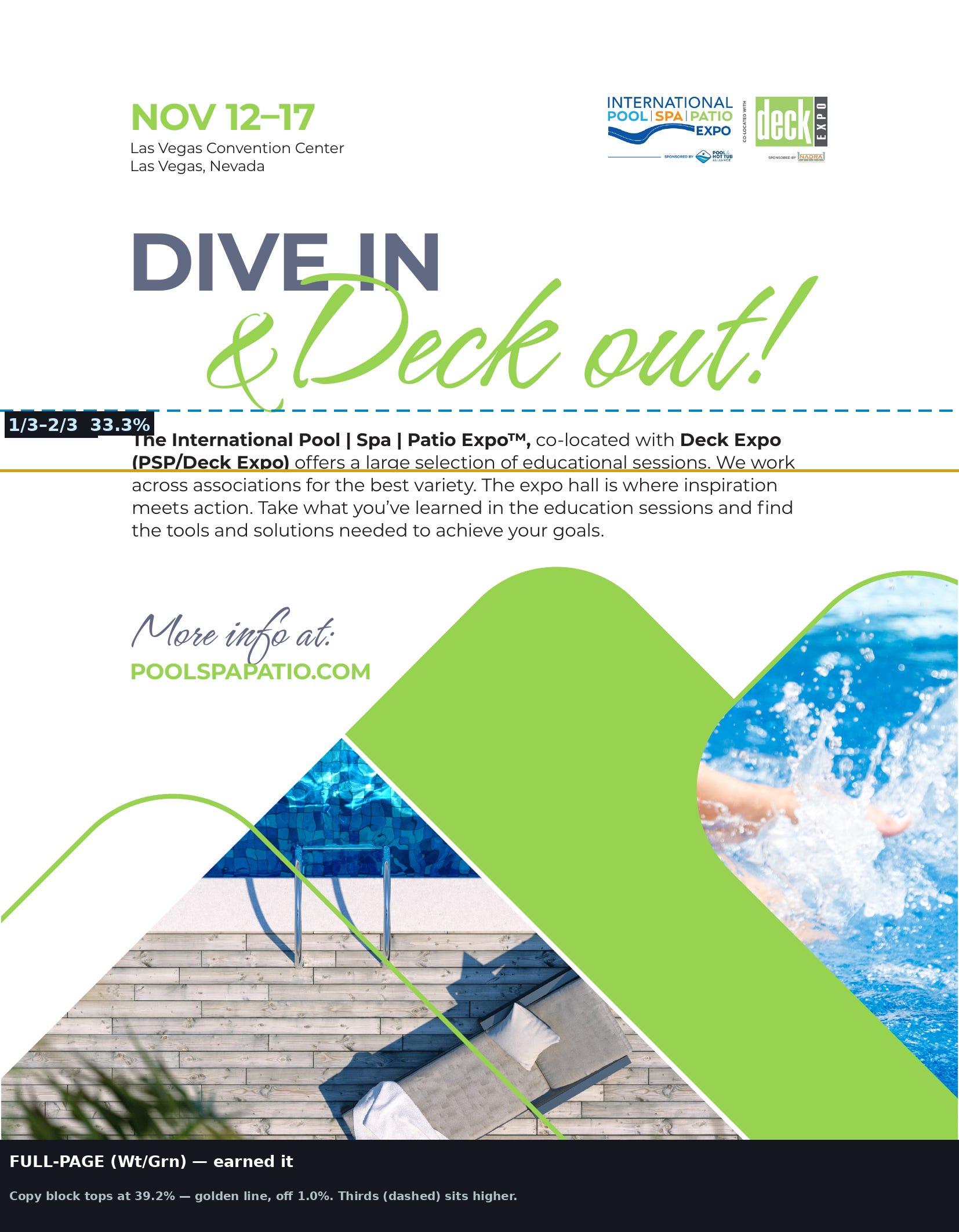
The green “&Deck out!” layout nails the golden ratio both ways: 39.2% across, 39.8% down, each within 1.5% of phi. This is the one page where the spiral truly fits.
Phi is genuinely present in our work, but it arrives honestly: through proportion and placement, guided by the eye rather than forced by a template.
And where a spiral would be a lie.
Then come the digital banners, where the golden-ratio myth crumbles completely.
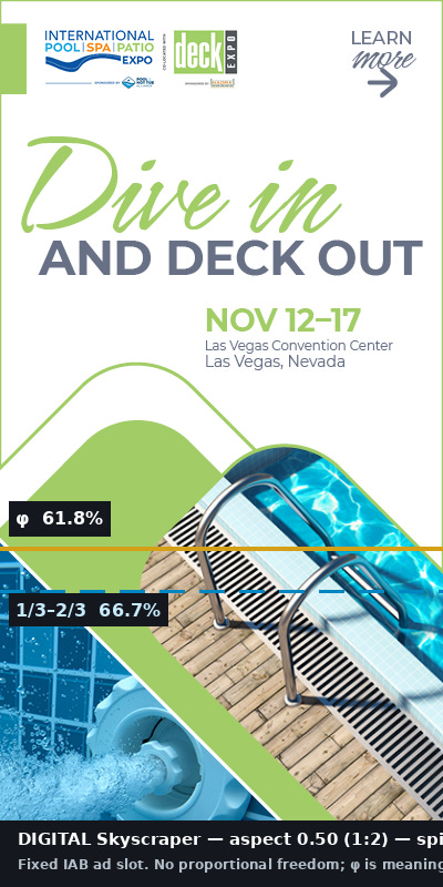
The ratio for a skyscraper banner is 1:5, that for a square is 1:1, and that for a leaderboard is almost 8:1. There is no golden ratio involved here, and there has never been any possibility of adding one.
These shapes were not our creation; Google and the IAB set the rules. When the canvas is a fixed ad slot, phi is not a choice you make or miss. It is simply off the table. Overlaying a spiral on a 1:5 banner is not analysis, instead it’s a decoration masquerading as geometry.
The thing nobody tells you about the spiral.
Here’s the twist that flips every “golden ratio in design” post you have ever scrolled by:
The golden spiral will only function within a golden rectangle, one with a ratio of 1.618 to 1; this is the shape from which the spiral is derived. If you remove it from that rectangle, it becomes a curve stretched to match the shape.
Now, take a look at the formats we actually work with:
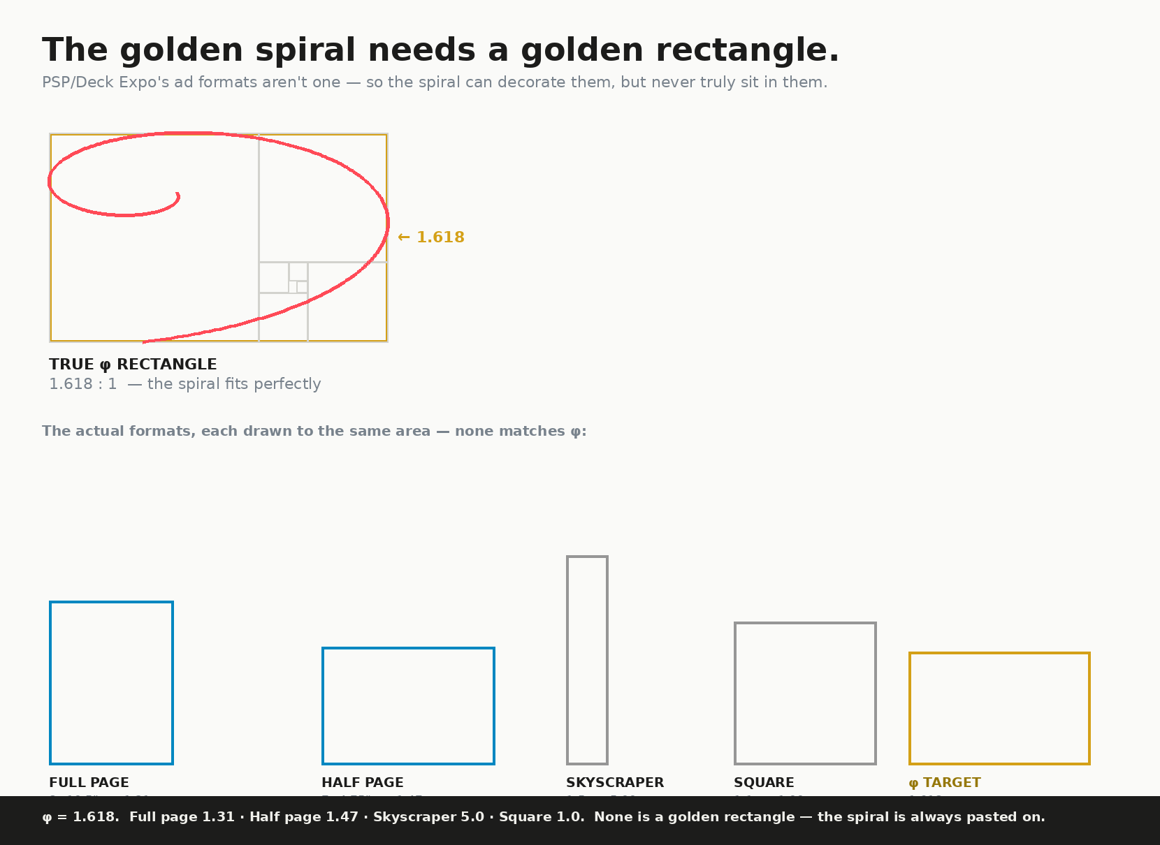
The golden spiral is correct, and here are the formats that we actually use. For a full page, it is 1.31; for a half page, 1.47; for a skyscraper, 5.0; and for a square, 1.0. None of these is a golden rectangle.
Full-page, half-page, and banner sizes are all set by press sheets, postal rules, and ad network specs, not by 1.618. So when someone photoshops a golden spiral onto a magazine ad and claims, ‘see how it all lines up,’ they are bending the spiral to fit a format it was never meant for. The spiral is usually pasted on after the fact onto a canvas that could never truly have held it.
The myth hides a simple truth: the golden proportion can genuinely appear in good design, but the golden spiral is usually just a flourish. One is a ratio a trained eye might spot; the other is just a sticker.
To be honest, we aren’t the only ones who are skeptical. Mathematicians such as Mario Livio and Keith Devlin have for many years highlighted the fact that the idea of phi dominating art and beauty is mostly retrofitted, a pattern that we look for and therefore come to see. Our own effort serves as a clear example of this: we discovered phi in places where we didn’t expect to (the half-pagers) and failed to find it in places where we thought it should be (the hero).
Did we meet the requirement?
Yes, and the honest version is better than the one in the brochure.
The golden ratio obtained its position in this campaign in the one way that is truly possible: through proportion, something sensed instinctively, in the elements which have space to breathe. It never appeared as a mysterious spiral uniting the entire system, since the formats we design for aren’t golden rectangles and never have been.
That is the real lesson of craft, and it is a Stoic one: judge things as they are, not as the story wants them to be. The tape measure does not care how dazzling a slide looks. Our flashiest ad is built on thirds, while the quieter ones stumbled onto phi by instinct. Both are good design, and pretending otherwise only weakens our craft.
Design instinct is genuine, and so is the ratio, though not the spiral.
— Dave & Deb